


this was the original image taken from google

pattern work

layering image

this was a task based on a previous banner tutorial. it is comprised of my own photos. it tried to give it an old vintage look by giving it a burnt orange tint and a coffee stain at the bottom to make it look like an old personal photo.

then i added a few overlay textures to reinforce the old worn look.

this is collage for a carnival poster

this is a street collage made up of images i took my self in the bristol area.

with this we were tasked to use complimenting colour schemes to colour in the centred line drawing then create and add a background, the legs and my initials/ signature.


this image was a final tutorial test for our tutor to understand weather our abilities in phototshop has grown to a more professional level, being able to understand how an image was made and weather we would be able to recreate it ourselves using only the separate image resources used to create the original image.
the top image is the original and the bottom is the recreation made by me.
this is inspirational research for 2 A3 posters


this is a more in depth analysis of focal points and how they are used to make an effective collage.


mood board of x-rays
inspiration
these are images more related to my subject matter in the proposal.

these drawn images are a pre concept design showing some of the base ideas i would like to incorporate if i choose to stick with this idea of war


after i had the concept planned i proceeded do draw a few thumbnails designs of bombs, aircraft and possibly medals

the background will be comprised of the english and american nazi flag, with letters from my granddad at war time as a border

this was the finished design for the first collage, it doesn't completely match my original designs but due to complications with getting the textures for my grandfathers letters from the war i decided to keep the frame work from the design but change the meaning from less personal to a more widely recognised message. the original design i had rested on those letters from the war, without them the whole thing seemed a little pointless, so instead changing it to the idea of americans and they're method of "peace keeping" or " freedom" seemed more fitting to show to an audience.

the freedom text needed to keep with the older look but still add a little light heartedness and style, so i decided to go with a 1930's, 1940's styled art deco text, this fitted with the war time aspect also so it was an easy decision

originally i wanted to add my own metal textures to the bombs but i felt it needed to have a darker element to contrast the joke being made, the silhouette of the atom bomb that was dropped on Hiroshima fitted this image in mind, i think that this was the right decision to lower the tone of the whole collage to subtly portray a more sadistic idea with out compromising the underlying joke trying to be made about americas agenda.
break down in photoshop

firstly i uploaded an image i took from one of my symbols attached to my drum kit, knowing it would be a great texture to overlay the flag i would be adding next. to get a better colour i added a colour overlay similar to its original colour only a little darker to bring out some of the groves in the metal work of the symbol, i then set the blending mode to darker colour

next i added a image of the american flag and turned to on its side to be flowing down the page

next i found added an image of the original fat boy atom bomb used by american on Hiroshima. i used the magic wand tool to select its outline and then i moved it across to a blank document

i then used the paint bucket tool to completely fill the bomb to make it a silhouette

i dragged the finished bomb into my main collage document and flipped it 180 degrees then tilted it slightly to make it look as if its falling

i duplicate the atom bomb 12 times, each time resizing it to make it look like its dropping, smaller and smaller. also each time it tilted the image slightly to form a flowing focal line down the page.

i then got an image of a peace sign and put it into photoshop

i resized it and placed it at the bottom of the bombs

i then downloaded the font "park lane NF", placed the text "freedom" in the two gaps between the three lines of bombs.

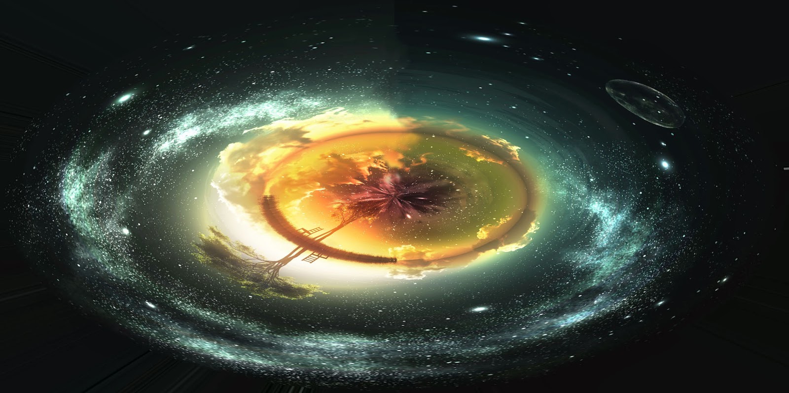
i proceeded to draw some poses for the body of christ because i felt he had to be in this collage, christianity is one of the biggest religions in the world so it seemed fitting.

i then brainstormed ideas about money and it relation to the church,because money is an object that we put value in, without our putting value on money it wouldn't be so life controlling. it also wouldn't be a symbol of absolute power, so in the collage im trying to show how the church depends on the power and grand status they are perceived to have through the ownership of large quantities of money
and why a humble religion would need to build such grand monuments when in fact their own teachings are comprised of not sinning in the manner of worshiping false idols- idols made by the hand of man.
i also thought of having the cross that jesus rests upon upside down because its a common misconception that an upside down cross represents satan and the anti christ but really it stands for the choice St Peter made during his crucifixion. he asked to be crucified upside down because he felt unworthy of the same death as jesus christ.

i focussed on the image of christ more after the brainstorming, i wanted him to have some symbolism so i gave hime angle and demon wings attached to his human centre, representing the good and evil attached to all of us, there arent any nails in his hands or feet to show that he (allegedly) went up their of his own freewill to absolve us of our sins in the eyes of god. the body on the side of the demon wing is also slightly thin, looking underfed almost. this represents us all having a darker side, but we dont indulge in it enough because it isn't socially accepted in society and is totally shunned by the church.

having a clear image of jesus in my collage now i turned to the rest of the image.
in the top right hand corner shows two hands shaking, one of a holy man and another of a rich man of power, i drew them shaking hands to show the connection the both have to money, the rich mans hand literally representing money and its control, possibly even showing that the money contolls the innocent church as well as it controls the rest of the world. i easily decided to add the Sistine chapel to the collage because its the most recognised place associated with the hub of christianity.


i obviously didn't have my own image of the sistine chapel so instead i went online and trace drew the outline and detail of the building, the grandiose of this building would really add to an ascetically pleasing image overall

the wings were made by taking a picture of an old computer chair i had, i added it into photoshop and cloned it many times to create the scaly texture of a demons wing. the arm is very bat like, deformed and elongated.

the angelic wings were made to look soft and bird like, flowing form, almost graceful, qualities associated with the idea of an angelic form. the textures on the wings were made the same way as the demonic side. i took an image of the softest thing i could think of in every day life, possibly something we all knew and could relate to having- i chose toilet paper. i took a picture of the toilet roll and duplicated it many times.

the body was actually made from my skin and hair, i took an image of my skin and duplicated it many times, being careful to duplicate the darker parts of shadows and skin pigments to make it seem more human and realistic. i wanted use my self as the primary source of the skin to further the idea of realism and the connection to the idea that jesus is not just a man but an idol that represents all of humanity.
the wood was made from some laminate flooring from my bedroom.

the money under the building represents the foundations of the church, literal and spiritual.
the building was built with the donations and other revenue that goes through the church, but what strikes me strange is why the church needed to build such grand and extravagant monuments when they them selves shun the man made temples and idols used to represent their god.

this is the final design for the collage, i decided against the cross being upside down as it didn't look right, it stopped the image from flowing and confused the eye. i didn't add the hands shaking because i felt it would clutter the collage too much.
break down in photoshop

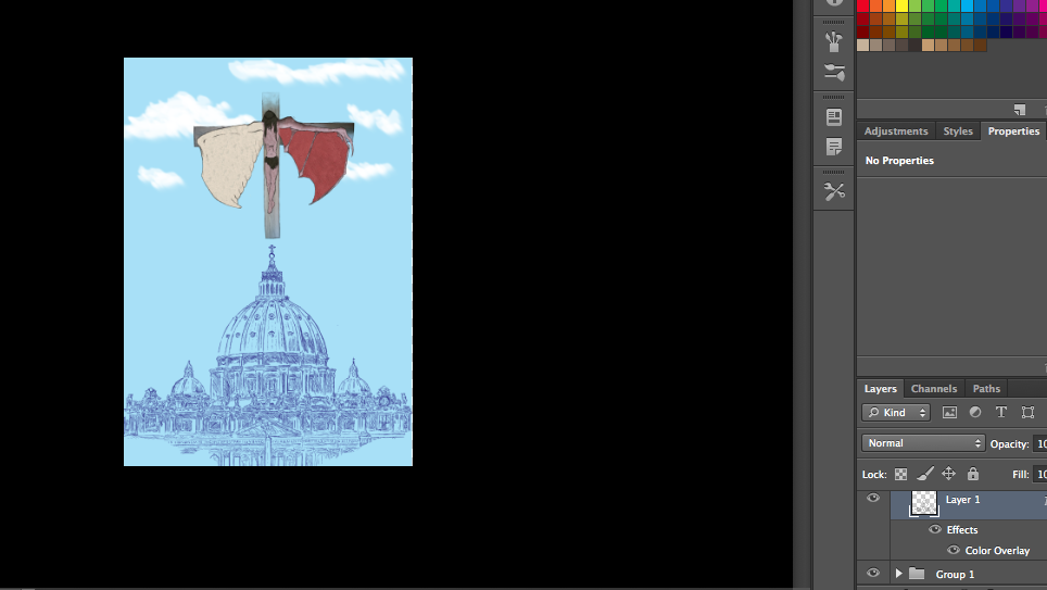
first of all i uploaded a picture of my design for the jesus on the cross

then i created a new layer and traced over my lines to thicken them up

i then uploaded a picture of laminate wood flooring from my house, duplicated it twice and resized it to fit in the outline of the cross

i then created a new layer and uploaded a photograph of my skin to a new layer, i then used the clone tool to fill in the body parts

after i added a picture of my hair into a new layer and used the clone tool to fill in the hair on the head and the cloth covering the genital area

i then uploaded a picture of an old computer into a new layer and used the clone tool to create the "evil" side of the wing

i copied the same method i used for the "evil" wing but instead using a different uploaded image of tissue paper.
i then moved onto the next part of the image

i uploaded an image of the Sistine chapel (not my own)

i then traced its outline using the brush tool

i removed the original image of the chapel and was left with this outline

to get the purple/blue tint to the outline i added an effect, colour overlay
with these two features done i opened a new photoshop document and started on the main back ground

for the background i used the paint bucket tool to make the background fully blue and then used the brush tool set at around 45-48 percent opacity to create a fluffy clouded sky.

i then grouped all of the layers of the first image and copied it into the new photoshop document and placed it at the top hovering in the sky
next i added in the earlier image if the Sistine chapel into the new document and resized and repositioned it accordingly to fit under the already present crucified crist

next i added in a new image of money, duplicated it and lined them underneath the chapel.

finally i added text using the font "papyrus"because it seemed like a fitting typeface for the type of collage i had created.
digitised textures


evaluation of digital artist
Maggie Taylor –
almost Alice
Why is her work
topical?
In her line of
images based upon Alice in wonderland (titled almost Alice) is a topical subject,
as the Alice in wonderland story is well known throughout many generations of
people, retold and improved upon over the ages but it still keeps true to the
idea of Alice in wonderland
What ideas both
through form and content are they exploring?
The ideas
expressed in the almost Alice line are all based upon the books supposed
context of drug use, which naturally leads to a surrealist take on life. Maggie
Taylor’s work using this surrealist take through the medium of photo collage
and Photoshop creates a Victorian esque stylized snapshot into the madness and
absurdity of the author’s universe.
What techniques
were employed to produce the selected work?
The techniques used
in her work take advantage of Photoshop and its ability to create works of art
that couldn’t possibly be seen in reality. She uses photography, collage and
Photoshop to realize her imagined concepts.
How does their
work relate to traditional art forms or the works of earlier artists?
I have researched
Maggie Taylor and in an interview she told her work is from her imagination,
which is why most of her work is dream like, or coined as surrealist
photography. The closest art form would be surrealism, stylized with a
Victorian photographic undertone.
How does it
define, critique or embrace the future?
It’s hard to
justify a relation to the future as her work is based on the past, a time when
the concept of the Alice in wonderland book was written in a time when opiates
and other drugs were legal and used recreationally by the public. The only way
to show how it defines or embraces the future would be how drugs and its use in
the Victorian era would change and shape our modern view on mind-altering
substances. Her modern work on the subject of Alice redefines outdated visuals
associated with wonderland and its many drug related themes helping to firmly
bring it into the future whilst still keeping true to the old, established look
Do you respond (or
not respond) to its content, its construction, its aesthetics, or its
storyline?
I did respond to
the content, aesthetics and storyline. I chose Maggie because I instantly felt
a connection with the subject matter; I loved Alice in wonderland because it
was a gateway into a truly magical world full of absurd creatures and people.
The madness and beauty of it all really appealed to me and Maggie Taylor’s work
on the subject really encapsulated that for me.

Unit 34 – Digital
Imaging (ND Interactive Media) – May 2014
Assignment
self-assessment form
Student Name: tyron
sheppard Collage subject: idolism/ peace and war
What do you think about your
design artwork? What do you feel about it?
|
Idolism
I think my design for the
piece is very relevant; it incorporates two sides of idolism, religion and
the society we’ve built around the idea of money. Two aspects of our world
linked together through our “worship” of these two ideas, because when you
boil both subjects down to is base level they’re both just an idea.
I feel it’s a loose subject
that’s very open to opinion. Right or wrong the concept of it makes sense-
our society and our beliefs are just an idea, an idea that we can change but
would totally collapse our modern day civilisation if we didn’t idolise these
concepts.
Peace and war
I think my design for this
piece is very relevant as it has an idea as old as America its self, the
message of peace in one hand and a bigger weapon in the other if you don’t comply
with the peace and freedom they’re “giving” you
I feel that this idea will
be an easier concept to mentally digest when compared to my other collage and
I am happy with the way it has turned out in regards to lay out, I feel the
piece flows very nicely
|
What about other pieces of
work you have looked at? Tell about your research
|
I have looked at many
collages from the web as apart of my research and in my analysis of most I
came across they all seemingly had one reoccurring theme; the underlying
ability to comment on or challenge ideas in modern society (for example a
peace sign comprised of weapons- in order to achieve peace there must be
war). I realised to make an effective piece of work I would have to
incorporate a strong message that was understandable to an audience. This
research helped me to envision concepts in a different way, telling a
story/idea through the medium of collage, a subject I’ve often found hard to
grasp.
|
What art materials and art
techniques have you been using or plan to use? What did you think of them?
|
Art materials: the materials
I used in the production of my collage were mostly scanned in sketch designs,
photographs taken by me and the use of Photoshop.
I think they work very well,
the use of Photoshop greatly increased the standard of work, I found it very
useful to drag in all of my resources and blend them together to make
something completely new. The brush tool worked greatly in my favour to
define and outline my scanned concept sketches, also it really made outlining
the sisteen chapel a thoroughly enjoyable task, being able to zoom in on the
image and trace the buildings finer contours.
The main technique used in
production of my work was the idea of focal points, allowing the image to
flow. During the design process this allowed me to make some decisions about
placement of certain aspects to crate a visually sound collage, helping the
eye to flow down the page, not confusing the brain with a cluttered mess.
|
What do you want to do for
your design artwork? Which styles, work by others or colours inspire your
design development or initial ideas?
|
Idolism
The main inspiration for my
work came from Caravaggio and his artwork depicting the crucifixion of st
peter. The idea of wanting to be crucified upside down because he felt
unworthy to be committed to death the same way as Christ really made me think
and question why st peter felt so strongly about the idea of Christ and his
connection to god.
It inspired me to think
about his idolism of this idea but it allowed me to think outside the box and
brainstorm some ideas that could be relevant to the message I wanted to
convey. Money was a natural fit because its the closest thing next to the
worship of a deity in the concept of basing a society on a subject of
“worship” or great belief.
Peace and war
The inspiration for this collage
came from a lot of the pro America, pro capitalism propaganda from around the
1930’s – 40’s but also the art deco movement. I really like these periods of
time in America because the art really signified the American patriotism and
the ever-evolving tastes of the American people.
|
Which aspects of your design work do you think could be made
better? How could you do this?
|
Idolism
I feel I could improve the
look with a few more designs, I had a couple of more images to symbolise and
reinforce my idea but due to time limitations I couldn’t figure out a way to
make the extra images flow nicely with the rest of the piece. In order to
rectify this I could spend a little more time in Photoshop playing about with
designs but I’m satisfied with the level of work I already have produced.
Peace and war
I feel I could improve upon
the amount of layers in the piece by adding more effects like tone and drop
shadows
|
What have you learned so far
in this project? Are you confortable using Photoshop? Would you like any
extra guidance on a specific aspect?
|
I have learned the ability
to confidently use the editing software built into Photoshop, tools such as
clone and warp effectively help me produce visuals that are understandable
and aesthetically pleasing. In short, yes I am comfortable in using Photoshop.
|
No comments:
Post a Comment